Nasty, Ugly Reversal
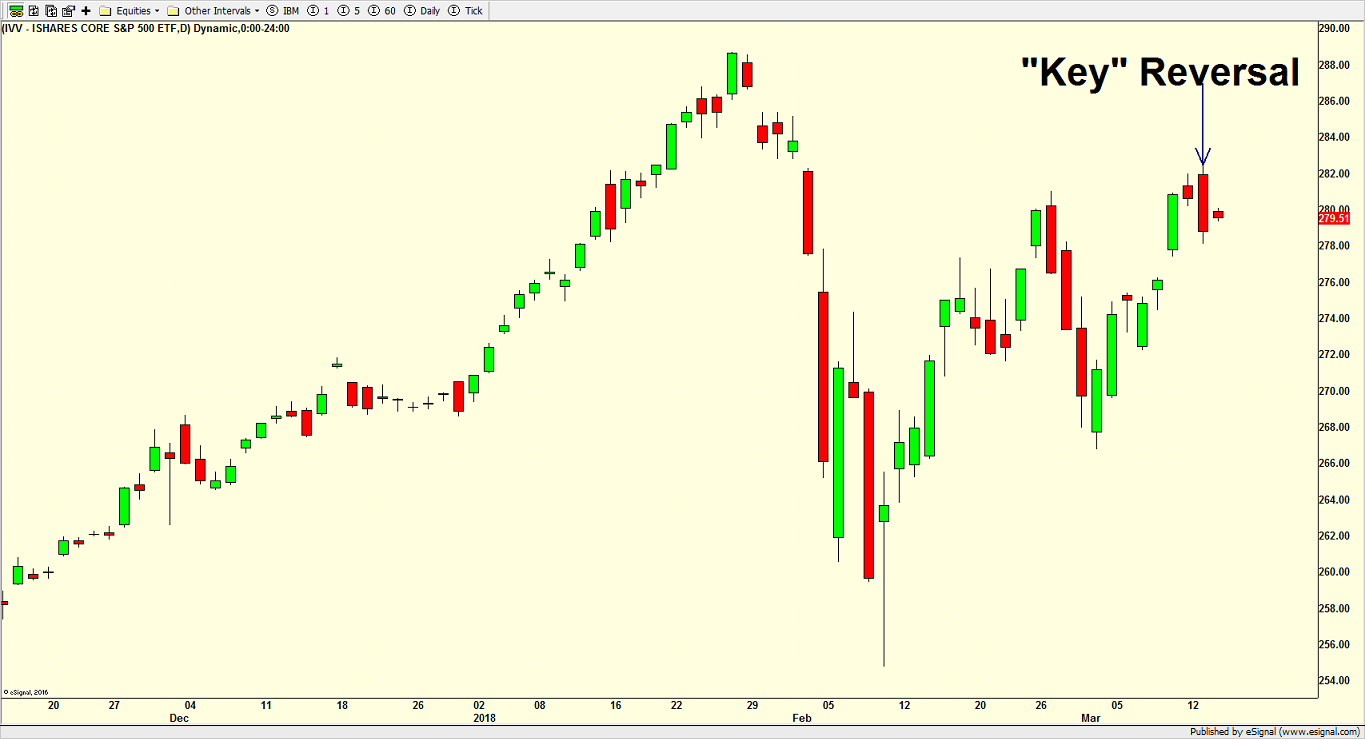
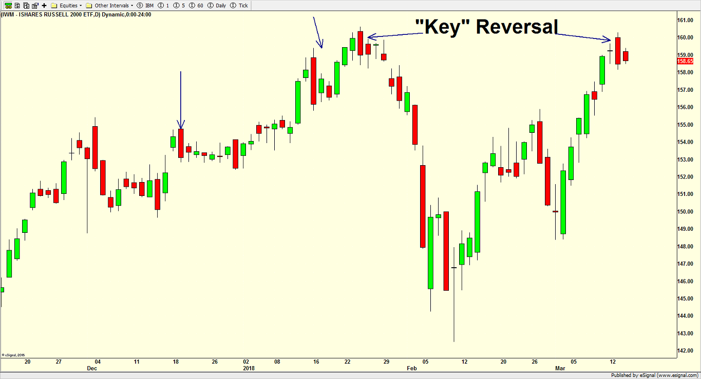
Stock market action on Tuesday printed a classic nasty and ugly reversal when looking at the charts. Stocks opened at the highs for the day and closed at their lows. Additionally, the move from high to low completely enveloped the previous day’s activity. While this does look really bad on a chart and people will often say it’s a classic key reversal which ends rallies and bull markets, research doesn’t support that claim. Sure, you can see and have seen this behavior at some market peaks. However, it has been seen so many other times that it’s track record is very poor. As with many claims, it worth paying attention to, but not always actionable.
Let’s start with the S&P 500 below. You can see what I am talking about just below the arrow. Additionally, the same thing occurred at the little peak in late February.
The Russell 2000 small caps are next and you can see four “key” reversals on the chart with the one at the highest peak leading to the correction. The others led to nothing.
Finally, the NASDAQ 100 is below.
Taken in a vacuum, “key” reversals have more bark than bite. However, when combined with other indicators and research, they may be able to support a thesis. In today’s case, I think we could see some mild weakness which ends up totaling 1-3%, but that should be another buying opportunity for a run to new highs. The NASDAQ 100 is already there and the Russell 2000 was a whisker away.
Tomorrow, I will review sector leadership along with junk bonds and the NYSE A/D line.


