Canaries Quiet

Thanks to my friend and business colleague/partner Dave Moenning (stateofthemarkets.com) for the canary pic.
It’s been a while since I last updated this column, but it’s not because I am lazy! There simply haven’t been enough changes in the data to warrant an update. The rally through year-end was very powerful and almost all areas we in gear to the upside. And even today, while there may be a few warnings, we don’t have bull market ending conditions in place. That potential climate seems to be months, if not quarters, or more away.
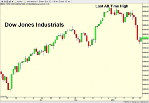
Let’s start with the indices and the Dow. All was well right into year-end and then something began to go wrong in a small way. The Dow has now given back all of the gains achieved since the last Fed meeting in mid December.
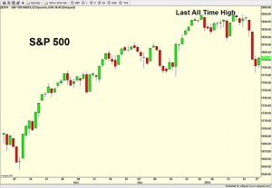
The S&P 500 is next and you can see it was a touch stronger than the Dow to begin 2014.
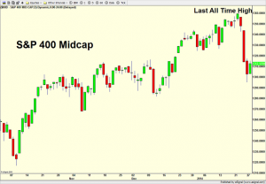
Turning to the S&P 400 Mid Cap below, a very different picture emerges as all time highs were seen last week.
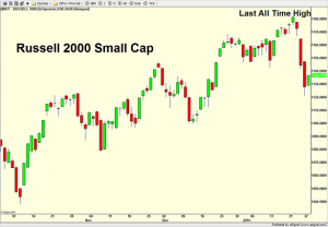
Next is the Russell 2000 Small Cap and just like the S&P 400 above, this index hit all time highs last week unlike the Dow and S&P 500.
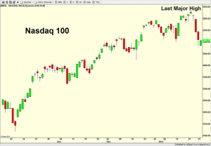
 Finally, the Nasdaq 100 is below and it looks very similar to the previous two indices except that it’s all time still remains from the Dotcom Bubble in March 2000.
Looking at all of the major indices, we have two small warning signs from the large cap space.
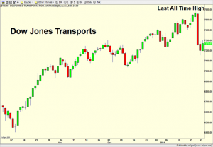
Moving to the key stock market sectors, we can see the Dow Jones Transports and its recent all time high last week. On the surface, that is very good action, but traditional Dow Theory would call a non-confirmation or divergence since the Dow Jones Industrials did not also see all time highs. While this can easily be corrected on a subsequent rally, it is nonetheless a warning sign now.
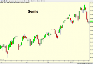
The semiconductors are below and they look very similar to most of the other charts with the last major high seen last week. This group is so crucial to the health of a bull market because historically, as go the semis so goes technology. And as goes tech so goes the market.
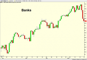
Banks are last in the sector space and they have really kicked it into high gear since the October bottom. It’s hard to argue with their leadership or that of the semis.
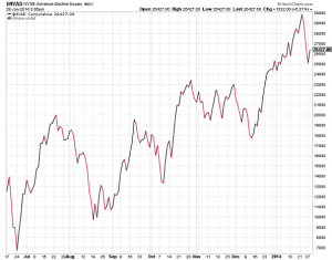
Another way to graphically see the underlying strength in the stock market is through the New York Stock Exchange Cumulative Advance/Decline Line which simply tallies the number the stocks going up and down on a given day and adds them to the previous day’s total. As you can see below, the NYSE A/D Line just recently made another all time high, which is not something we typically see at major market peaks.
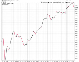
Lastly, let’s turn to the high yield (junk) bond sector, which is one of the primary canaries we watch. Junk bonds are among the riskiest and most volatile in the fixed income area and are definitely among the most sensitive to ripples in the liquidity stream. After being left for dead during the second quarter of 2013, they did a complete 180 and slowly and steadily marched back to all time highs, surprising many people, including me! It’s going to take another mini cycle before high yield warns again.
Summing it all up, the bull market is old, but alive and basically well. We have a few yellow lights from the Dow Jones Industrials lagging, but that can and may be corrected during the first few months of 2014.

